
Integrity Care Group
Consolidating Xpress Wellness and Integrity Urgent Care brands into Integrity Care Group by desigining a B2B and B2C website.
UX/UI Design
Web Design
Figma
Project Overview
As a junior designer, I supported the UX/UI team throughout several phases of this website redesign. The objective was to merge two existing distinct brand identities, location networks, and service catalogs into one modern, user-friendly platform. We established a dedicated B2B site for corporate clients (Integrity Care Group) and an accessible B2C site for daily patient care (Integrity Urgent Care). Some of my contributions included establishing a tagging system, simplifying location and service navigation, and leveraging AI tools to audit and organize heavy medical copy into clean wireframes.
TEAM
Senior UX/UI Designer, Project Lead
Sadhy Giraldo
UX/UI Designer, Junior
Sean Brydon
UX/UI Intern
Sophia Schroy
Senior Copywriter
Gina Licciardi
Development Lead
Arturo Alvarado
TEAM
Senior UX/UI Designer, Project Lead
Sadhy Giraldo
UX/UI Designer, Junior
Sean Brydon
UX/UI Intern
Sophia Schroy
Senior Copywriter
Gina Licciardi
Development Lead
Arturo Alvarado

Exploration
Exploration and Discovery
To merge two distinct healthcare brands into a unified digital brand, our discovery phase began with a comprehensive content audit and competitive analysis. By evaluating navigation patterns and creating visual mood boards, we identified key friction points and developed B2B and B2C user journeys. To ensure every user segment was accounted for, we developed 11 distinct personas spanning both audiences, directly informing the structure of our new sitemaps.
To serve these distinct needs seamlessly, we established a split site architecture: an accessible B2C patient platform, Integrity Urgent Care, optimized for patient services, paired with a dedicated B2B enterprise hub, Integrity Care Group, focused on occupational health services. Together, these visual and structural foundations led us to the design phase, where we began with simple wireframes and delivered high-fidelity results.


UX / UI Design
Our Process
Guided by our 11 user personas and sitemap architecture, we transitioned from discovery into structural design to translate strategy into tangible user paths. To solve the challenge of sifting through dozens of legacy pages, we leveraged AI tools to audit, synthesize, and organize heavy clinical text that we could insert to concise, scannable content blocks. This allowed us to define clear information and rapidly populate low-fidelity wireframes, providing stakeholders with an early visual baseline.
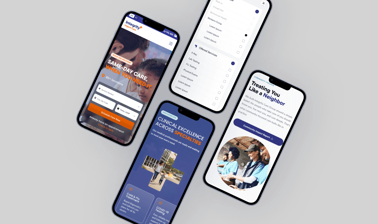
Once stakeholder feedback was integrated, we elevated the wireframes into high-fidelity designs, where I focused on crafting two critical interaction systems. I helped design a dynamic location and service filtering interface that allows B2C patients to quickly locate clinics by proximity and available services. Additionally, I established a color-coded tagging system that visually categorizes types of website content across all pages. Together, these responsive UI components streamlined navigation for patients while establishing a scalable design system ready for QA testing and developer handoff.

Collection of web pages for enterprise facing site.
Impact and Reflection
Impact and Key Takeaways
The launch of the new website unites both healthcare brands under a clean, scalable platform built to improve patient engagement and accessibility. By splitting the site into two distinct experiences, patients can instantly find nearby urgent care and check in online, while business clients have a direct, professional path to explore corporate healthcare services.
Supporting the core UX/UI team at MAD gave me hands-on experience working with design systems, building modular components, and using AI to solve complex content layout challenges. Collaborating with senior designers and acting on stakeholder feedback taught me how to balance business goals with real user needs, showing me firsthand how thoughtful design directly improves everyday healthcare interactions.

Collection of web pages for patient facing site.
Collection of web pages for enterprise facing site.
Want to know more?
More Projects






Integrity Care Group
Consolidating Xpress Wellness and Integrity Urgent Care brands into Integrity Care Group by desigining a B2B and B2C website.
UX/UI Design
Web Design
Figma
Project Overview
As a junior designer, I supported the UX/UI team throughout several phases of this website redesign. The objective was to merge two existing distinct brand identities, location networks, and service catalogs into one modern, user-friendly platform. We established a dedicated B2B site for corporate clients (Integrity Care Group) and an accessible B2C site for daily patient care (Integrity Urgent Care). Some of my contributions included establishing a tagging system, simplifying location and service navigation, and leveraging AI tools to audit and organize heavy medical copy into clean wireframes.
TEAM
Senior UX/UI Designer, Project Lead
Sadhy Giraldo
UX/UI Designer, Junior
Sean Brydon
UX/UI Intern
Sophia Schroy
Senior Copywriter
Gina Licciardi
Development Lead
Arturo Alvarado
TEAM
Senior UX/UI Designer, Project Lead
Sadhy Giraldo
UX/UI Designer, Junior
Sean Brydon
UX/UI Intern
Sophia Schroy
Senior Copywriter
Gina Licciardi
Development Lead
Arturo Alvarado
Exploration
Exploration and Discovery
To merge two distinct healthcare brands into a unified digital brand, our discovery phase began with a comprehensive content audit and competitive analysis. By evaluating navigation patterns and creating visual mood boards, we identified key friction points and developed B2B and B2C user journeys. To ensure every user segment was accounted for, we developed 11 distinct personas spanning both audiences, directly informing the structure of our new sitemaps.
To serve these distinct needs seamlessly, we established a split site architecture: an accessible B2C patient platform, Integrity Urgent Care, optimized for patient services, paired with a dedicated B2B enterprise hub, Integrity Care Group, focused on occupational health services. Together, these visual and structural foundations led us to the design phase, where we began with simple wireframes and delivered high-fidelity results.
UX / UI Design
Our Process
Guided by our 11 user personas and sitemap architecture, we transitioned from discovery into structural design to translate strategy into tangible user paths. To solve the challenge of sifting through dozens of legacy pages, we leveraged AI tools to audit, synthesize, and organize heavy clinical text that we could insert to concise, scannable content blocks. This allowed us to define clear information and rapidly populate low-fidelity wireframes, providing stakeholders with an early visual baseline.
Once stakeholder feedback was integrated, we elevated the wireframes into high-fidelity designs, where I focused on crafting two critical interaction systems. I helped design a dynamic location and service filtering interface that allows B2C patients to quickly locate clinics by proximity and available services. Additionally, I established a color-coded tagging system that visually categorizes types of website content across all pages. Together, these responsive UI components streamlined navigation for patients while establishing a scalable design system ready for QA testing and developer handoff.
Collection of web pages for enterprise facing site.
Impact and Reflection
Impact and Key Takeaways
The launch of the new website unites both healthcare brands under a clean, scalable platform built to improve patient engagement and accessibility. By splitting the site into two distinct experiences, patients can instantly find nearby urgent care and check in online, while business clients have a direct, professional path to explore corporate healthcare services.
Supporting the core UX/UI team at MAD gave me hands-on experience working with design systems, building modular components, and using AI to solve complex content layout challenges. Collaborating with senior designers and acting on stakeholder feedback taught me how to balance business goals with real user needs, showing me firsthand how thoughtful design directly improves everyday healthcare interactions.
Collection of web pages for patient facing site.
Collection of web pages for patient facing site.
Want to know more?
More Projects
Integrity Care Group
Consolidating Xpress Wellness and Integrity Urgent Care brands into Integrity Care Group by desigining a B2B and B2C website.
UX/UI Design
Web Design
Figma
Project Overview
As a junior designer, I supported the UX/UI team throughout several phases of this website redesign. The objective was to merge two existing distinct brand identities, location networks, and service catalogs into one modern, user-friendly platform. We established a dedicated B2B site for corporate clients (Integrity Care Group) and an accessible B2C site for daily patient care (Integrity Urgent Care). Some of my contributions included establishing a tagging system, simplifying location and service navigation, and leveraging AI tools to audit and organize heavy medical copy into clean wireframes.
TEAM
Senior UX/UI Designer, Project Lead
Sadhy Giraldo
UX/UI Designer, Junior
Sean Brydon
UX/UI Intern
Sophia Schroy
Senior Copywriter
Gina Licciardi
Development Lead
Arturo Alvarado
TEAM
Senior UX/UI Designer, Project Lead
Sadhy Giraldo
UX/UI Designer, Junior
Sean Brydon
UX/UI Intern
Sophia Schroy
Senior Copywriter
Gina Licciardi
Development Lead
Arturo Alvarado
Exploration
Exploration and Discovery
To merge two distinct healthcare brands into a unified digital brand, our discovery phase began with a comprehensive content audit and competitive analysis. By evaluating navigation patterns and creating visual mood boards, we identified key friction points and developed B2B and B2C user journeys. To ensure every user segment was accounted for, we developed 11 distinct personas spanning both audiences, directly informing the structure of our new sitemaps.
To serve these distinct needs seamlessly, we established a split site architecture: an accessible B2C patient platform, Integrity Urgent Care, optimized for patient services, paired with a dedicated B2B enterprise hub, Integrity Care Group, focused on occupational health services. Together, these visual and structural foundations led us to the design phase, where we began with simple wireframes and delivered high-fidelity results.
UX / UI Design
Our Process
Guided by our 11 user personas and sitemap architecture, we transitioned from discovery into structural design to translate strategy into tangible user paths. To solve the challenge of sifting through dozens of legacy pages, we leveraged AI tools to audit, synthesize, and organize heavy clinical text that we could insert to concise, scannable content blocks. This allowed us to define clear information and rapidly populate low-fidelity wireframes, providing stakeholders with an early visual baseline.
Once stakeholder feedback was integrated, we elevated the wireframes into high-fidelity designs, where I focused on crafting two critical interaction systems. I helped design a dynamic location and service filtering interface that allows B2C patients to quickly locate clinics by proximity and available services. Additionally, I established a color-coded tagging system that visually categorizes types of website content across all pages. Together, these responsive UI components streamlined navigation for patients while establishing a scalable design system ready for QA testing and developer handoff.
Collection of web pages for enterprise facing site.
Impact and Reflection
Impact and Key Takeaways
The launch of the new website unites both healthcare brands under a clean, scalable platform built to improve patient engagement and accessibility. By splitting the site into two distinct experiences, patients can instantly find nearby urgent care and check in online, while business clients have a direct, professional path to explore corporate healthcare services.
Supporting the core UX/UI team at MAD gave me hands-on experience working with design systems, building modular components, and using AI to solve complex content layout challenges. Collaborating with senior designers and acting on stakeholder feedback taught me how to balance business goals with real user needs, showing me firsthand how thoughtful design directly improves everyday healthcare interactions.
Collection of web pages for patient facing site.
Collection of web pages for enterprise facing site.
Want to know more?
More Projects